
My wife and I made a conscious decision to live in the city. We both grew up in smaller areas that didn’t have as much access to culture and the arts. Even in the face of the high expense, heavy traffic, and crime, we still find living amongst culture a benefit that’s strong enough to keep us here. We want a place that invests in its parks and public arts in addition to having great food, music, and theater that can come from a large city.
For all the people like myself who live in urban areas and want their cities to invest in culture, we tend to have a big disconnect between how we view the physical world and the digital spaces in which we’re spending more of our time. We are escaping into our social media sites and apps at an ever-increasing pace, and we need to be thinking about how we shape culture in these spaces too.
The internet age is still in its infancy. We’re shaping this culture with how we’re tackling online bullying and anonymous harassment. With how we’re handling privacy. With disinformation. With how we’re handling the mashup of other real-world cultures that we’ve never had this amount of access to.
If we don’t think this through and consciously shape our digital spaces, they will shape us.
We want our digital spaces to have a point of view, but not to the point of being difficult to figure out. We want to have a chuckle, but not slow down what we’re trying to accomplish. We want thoughtful software that shows that it’s crafted with care — not because it’s made by people who are trying to squeeze every dollar they can, but because it’s made by people who care about solving a problem well.
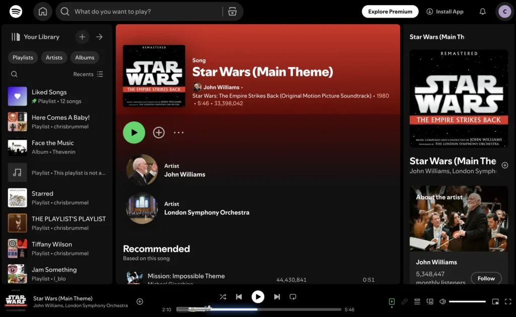
Sometimes it’s a small little touch, like what Spotify did when listening to Star Wars soundtracks. They change the progress bar into a lightsaber. It’s fun and cute and expresses a little bit about themselves. They didn’t have to do this, but they chose to invest in something fun and playful. I don’t think they would have done this if they weren’t Star Wars fans.
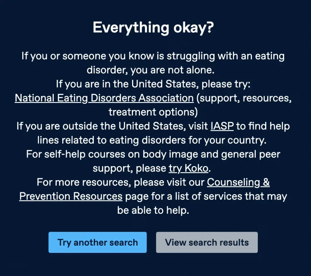
Sometimes it’s an important detail. “Thinspo” is a term for sites that promote unhealthy body images of extremely thin people that others use as inspiration to lose weight. People who go to these sites tend to suffer from a negative body image, and Tumblr pops up this PSA when people search for “thinspo” and offers up some help if someone needs it. They make the link “Try another search” highlighted while diminishing the “View search results” link.
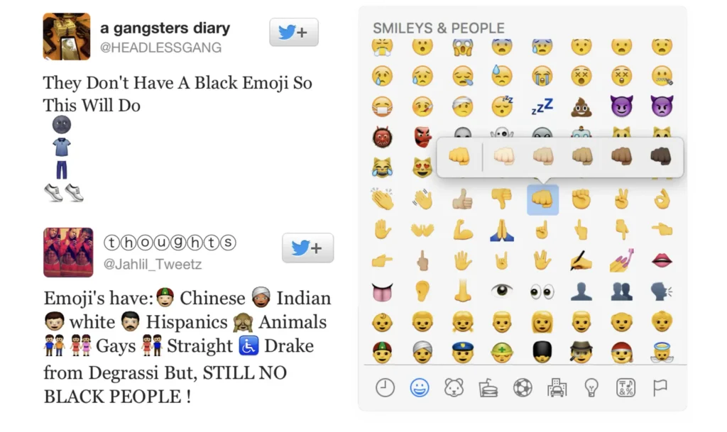
Sometimes there’s a real friction to not allowing people a way to express themselves. Emojis took the Simpsons’ route and made everything yellow. But even the Simpsons knew that yellow wasn’t the most representative (i.e. Carl, Abu, etc.). In 2015, iOS added multiracial emojis, and people really celebrated. Its absence really held people back from communicating the way they wanted to.
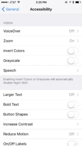
Sometimes investing in culture in software is life-changing. Apple has consistently been adding accessibility features over the last decade, but when they released iOS 5 in 2011, they made a huge leap. I saw posts by blind people spring up saying that it changed their life overnight. One started off with…
“Last Wednesday, my life changed forever. I got an iPhone. I consider it the greatest thing to happen to the blind for a very long time, possibly ever. It offers unparalleled access to properly made applications, and changed my life in twenty-four hours.”
Some of these examples are just cute, and some of them really matter — but they all show intentionality. We need to be more intentional and focus on the details of how we create a healthier digital space. If we don’t, the worst aspects of our collective psyche will shape it for us.
We intrinsically know this when it comes to our cities, and there are real benefits to doing so. Introducing culture and the arts into a city has been found to reduce stress, make people feel happier with their lives, and satisfied with their health. Communities with high engagement in the arts are more involved in their area. There are tons of economic benefits, as culture and the arts gentrify neighborhoods (which, I know, is a mixed bag itself). The arts make people more empathetic to the world around them.
Good design means caring about how things feel, and not just how they function. If our cities deserve beauty, joy, and meaning, so do our digital spaces. These platforms aren’t just tools—they’re where we connect, create, laugh, cry, and live. If we don’t shape them with the same care and intention we give to our streets and stages, we’re letting algorithms define our culture. These platforms are becoming the new public squares, parks, and performance venues of our time. Culture doesn’t just happen — it’s built, detail by detail, by people like us.